Case study · Brand Identity
Babyqu Kids Shop: A soft, rounded wordmark for a children's store
Logo in two colourways applied to a canvas tote
- Client
- Babyqu Kids Shop
- Year
- 2021-2025
- Sector
- Retail · Kids
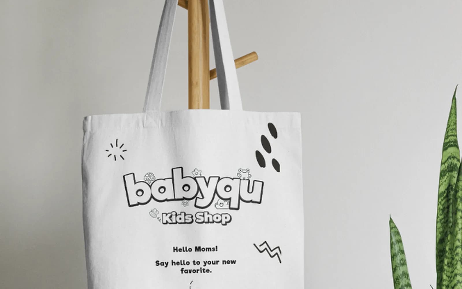
A friendly wordmark for Babyqu Kids Shop with bubbly letterforms, a small bear detail and two colourways, applied to a tote bag.
Context
Babyqu sells children's products and wanted a name that parents would remember and children would find cheerful.
The challenge
The logo had to feel playful without becoming childish clip art, and it had to work on dark social media backgrounds as well as on white packaging.
- Memorable and soft
- Two colourways for light and dark use
- Ready for bags and packaging
Approach
How it came together.
- 01
Rounded every letter
Thick, rounded letterforms with an outline make the name feel soft and safe, like a toy.
- 02
Added one character detail
A small bear on the letter gives the brand a mascot without needing a separate illustration.
- 03
Applied it to merchandise
A canvas tote mockup confirmed the mark holds up as a single-colour print.
Gallery
Logo & merchandise
A soft, rounded wordmark in two colourways, applied to a canvas tote.
What was delivered
- Wordmark
- Dark and light colourways
- Tote bag application
What changed
- The shop has a recognisable mark for store, packaging and social media